After defining the product structure, it’s time to start working on the look and feel. At this point the designer should think, amongst other things, on the appropriate color scheme to target the product’s audience.
The safest decision — mosts of the time — is to opt for a white theme. In most cases, a white background is easier to work with for 1 simple reason: black text on white background means better contrast, scanning perception and readability.
A few months ago I was assigned to an Azure cost management project called SC:Lens. So, it seemed like the perfect situation to put my skills to the test and cross over to the ‘Dark Side’.
 Property of @ Lucas Films
It was no surprise I started facing usability issues the moment I began ‘colouring’ the wireframes. Great UX starts with great readability and high contrast between text and background. So in other words, black text on white background means optimised legibility.
But try white text on a dark background and the story changes a little bit.
To guarantee readability and to positively influence the performance of a product, be prepared to go through a meticulous process of font selection.
But lets take a few steps back. If Dark UI has all these problems, why did I opt for it to begin with?
- Its purpose. The project is an cost management project and dark colours are often associated with power, elegancy and prestige.
- It’s not text oriented. Unlike a blog which contains big blocks of text, it’s not content heavy.
- To reduce eye strain. As we expect users to stay for long periods of time, a darker scheme can reduce eye strain.
 Rack Grid Expanded
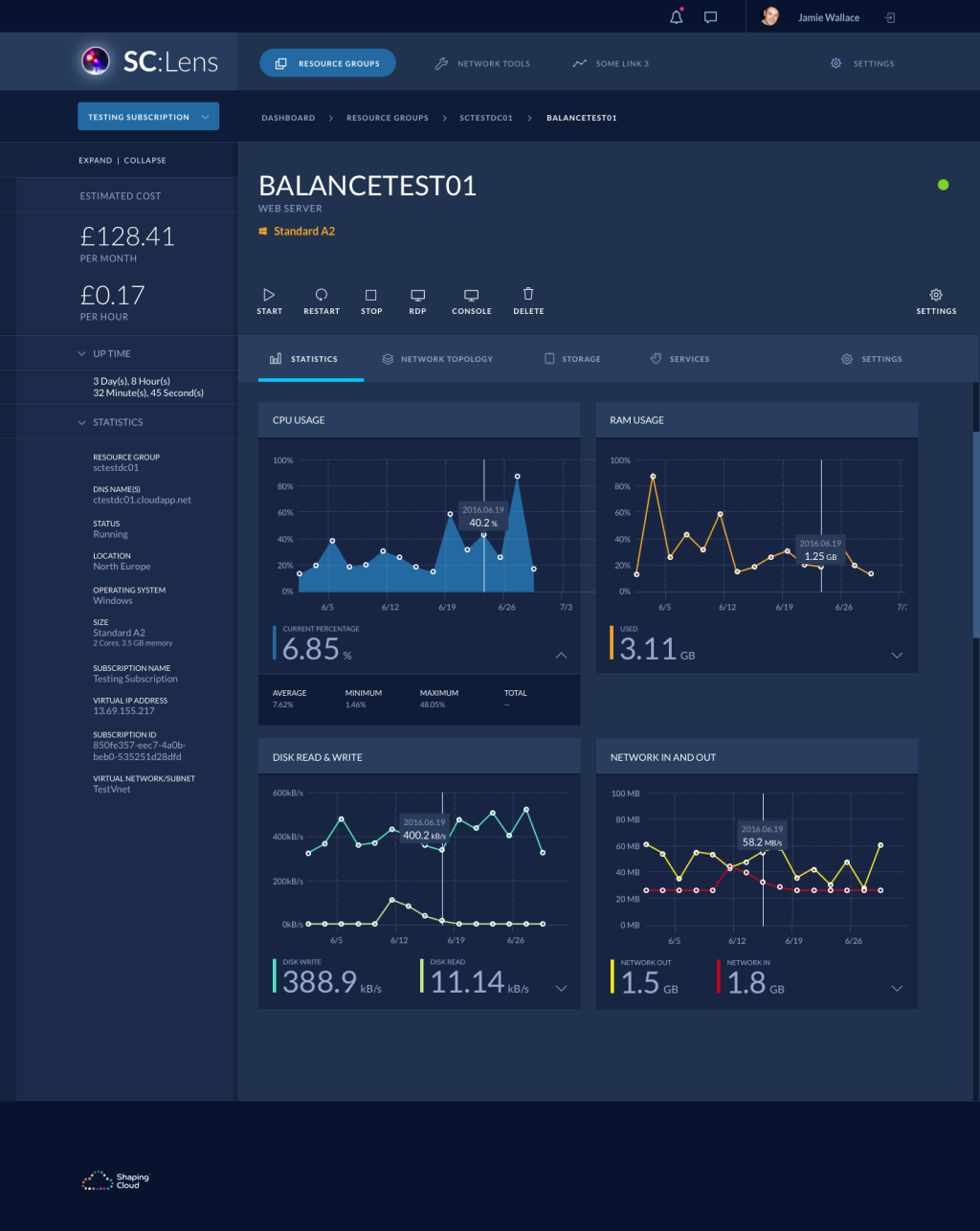 Server Detail
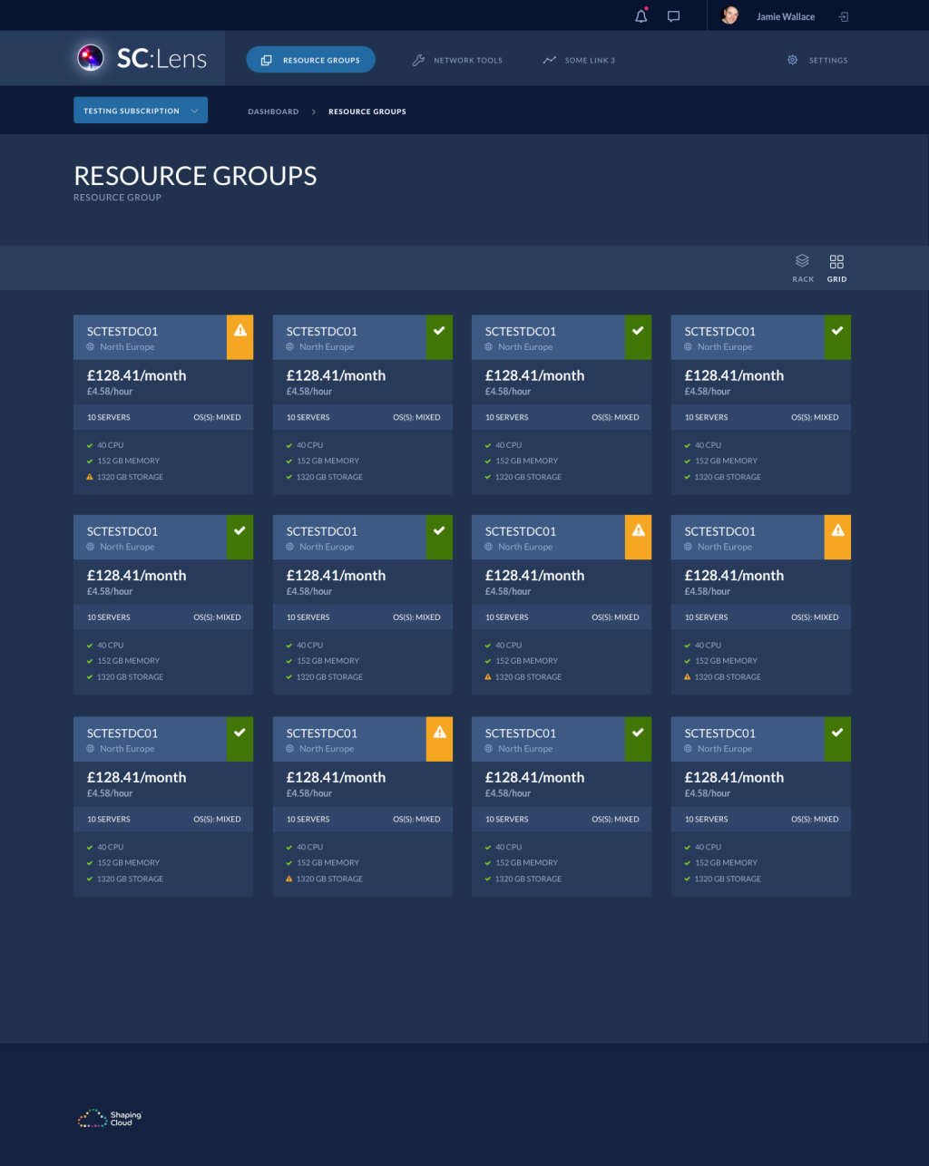 Group Grid
So when does it work well?
To match the low-light environment of your living room when you’re watching TV, products such as movie streaming services and gaming consoles normally opt for a dark-themed UI.
As it blends with the environment, it helps the important content stand out as you sit far away from the TV.
 Netflix app — iOS
Dark-themed UIs can also help on improving the experience when users stay for long periods of time.
Developers work many hours a day in front of a computer, using their code editing software. The dark UI not only helps them with eye strain but it also creates enough contrast on different code tags, making it easier to rapidly scan the code.
 Sublime text 3
Considerations:
Less contrast means better contrast
Even though it’s true in a traditional sense, white elements on a dark backgrounded interface are not the ideal way of highlighting content. That much contrast increases eye strain and is not necessary for elements to stand out. But be aware of older screen contrasts.
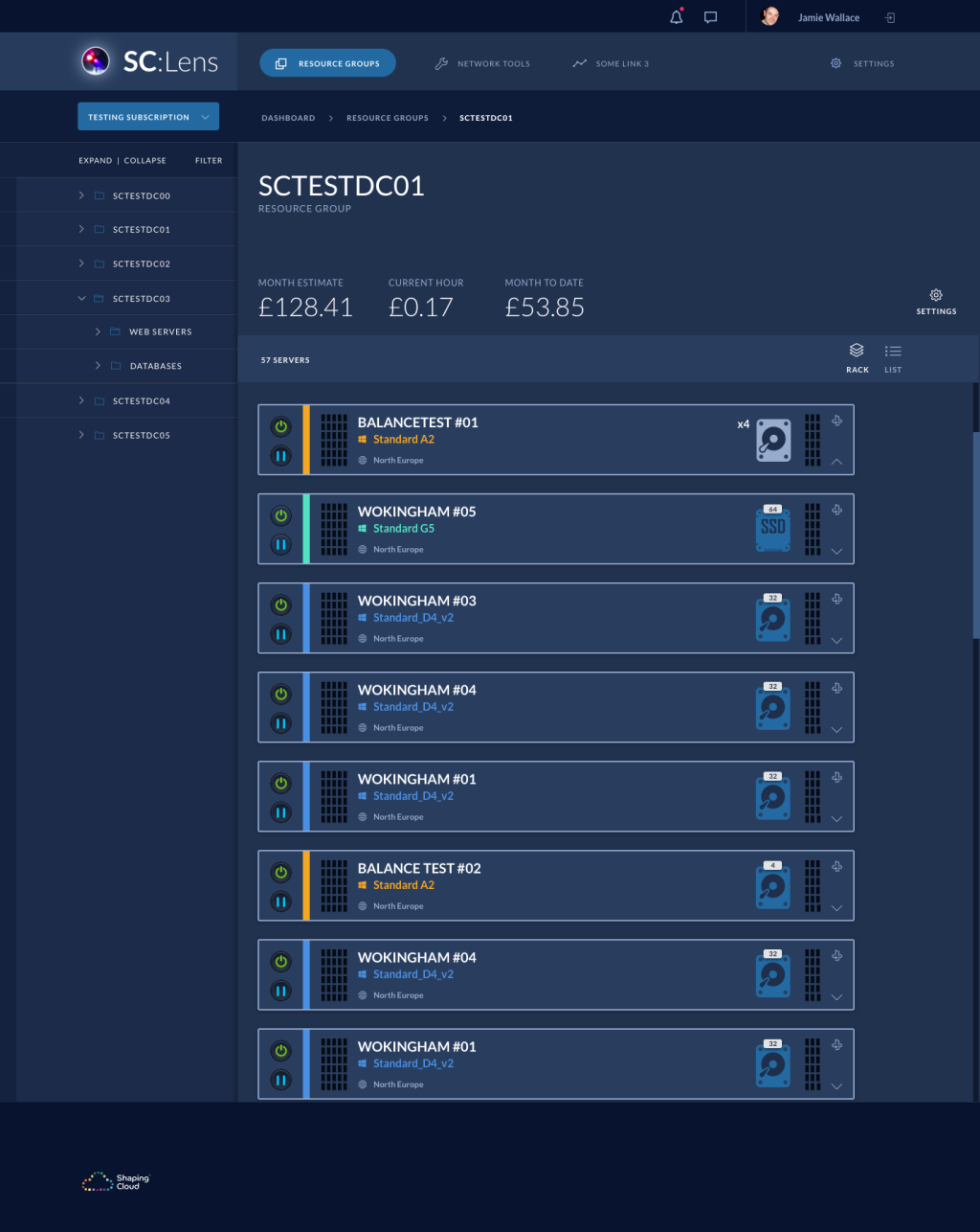 Rack Detail
Lots of text? Stay in the light!
As mentioned before, if the website’s content is text heavy, the use of a white background is ideal to ensure readability. This doesn’t necessarily mean the entire website has to be white. A single section can be enough to host the text based content.
 Rocket.Chat Blog Article
Lighter fonts for a bolder look
Due to our eyes’ perception of light and dark, white text on a darker background will always look bolder than its counterpart. This means that sometimes you must have background specific font weights in your design.

Too much space is never enough
Make sure to be generous with the spacing of your design elements on a dark background. Then when you’re done, add a little more space. This is will help balance the contents and increase readability and perceptibility.
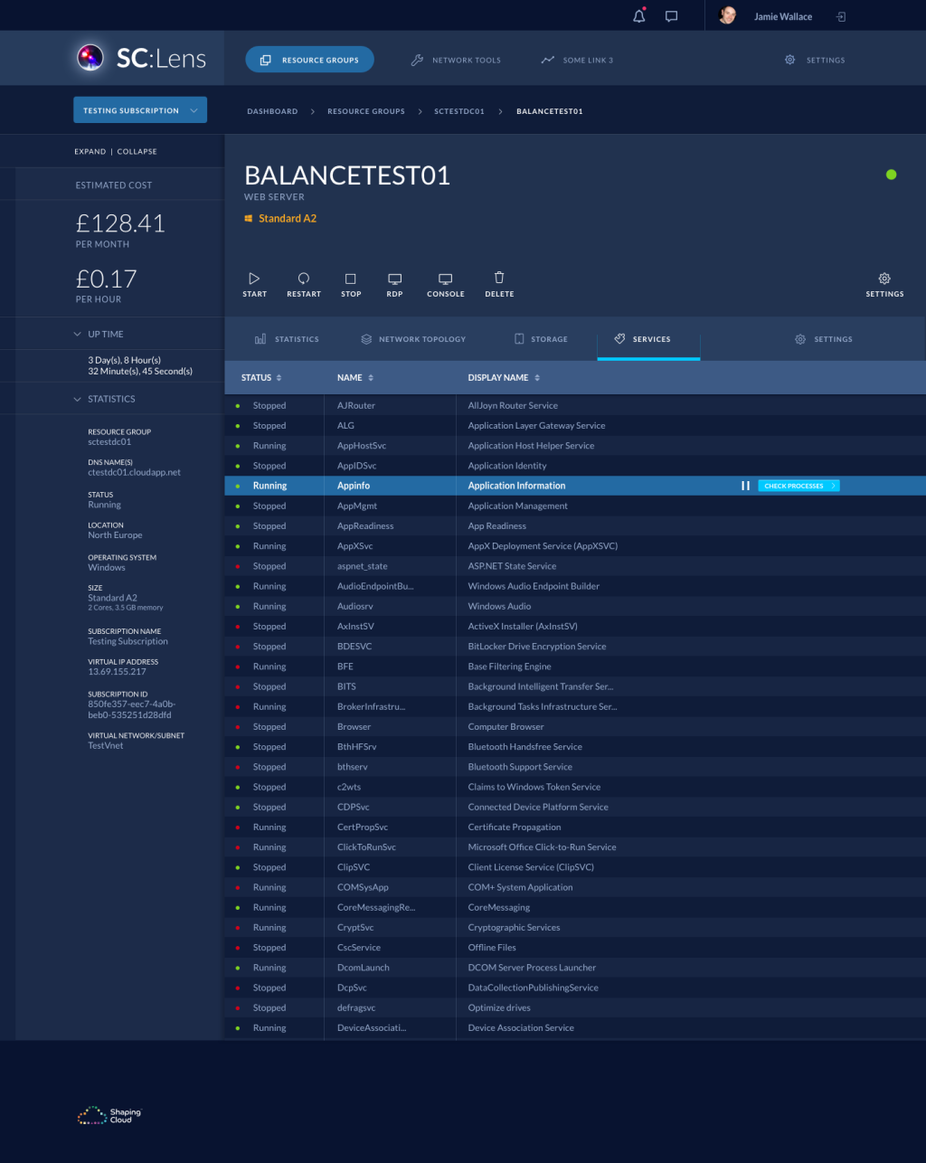 Service Detail
Final Thoughts
A light UI is always the safe bet, but in some cases, a dark UI can be a winner. So choose wisely.